( what is Oracle MAX? ) Oracle Mobile application accelerator allows you to create a cross-platform (iOS and Android, phone and tablet) mobile app visually without coding using only a browser.
to steal someone else's saying "this is primarily for business users. Indeed, let’s imagine the situation in your organization when you have a requirement for building some relatively simple mobile app, but IT staff is completely busy and cannot be involved?! Here Oracle MAX can help you!" - thanks Emin Askerov for the quote from the blog.
Here's a youtube video from Grant Ronald that talks about what Max is :
Let's have a look at a tutorial to see how it all works
http://www.oracle.com/webfolder/technetwork/tutorials/cloud/max_crm/max.html#overview
Lets run through it. Most of the below is verbatim through the tutorial so we can see how it all actually works in practice
First sign in to Oracle MCS Mobile Cloud Service using Chrome. Do Not Use IE or Firefox you will have problems down in the middle of the tutorial and it will be very frustrating.
For the purposes of this tutorial we will use the packaged CRM service rather than any difficult MCS integrations we are doing in the rest of our blogs. Since this is a shared integration, the backend CRM service implementation is already uploaded, so we can proceed with our MAX Implementation.

Click Mobile Apps

- Click New Application.
- Name the app
My CRM. Click Next.

Now Choose Simple Screen

Enter
Dashboard as the screen title. Click Next.

From Custom,List, Form and Dashboard along the bottom, choose Dashboard, Next, then Create
We now have a mobile app. Doesn't do much yet though, lets add some stuff.
First lets lay out our Dashboard
In the Preview, select the Tile component (Tile 1) to open the Properties Inspector for Tile 1.
Use the Properties Inspector to set the tile's dimension and content layout:
- In the Tile Dimensions section, select 2x1 to allow the counters to fill the width of the screen.


Because you want to keep the three metrics together when the dashboard is viewed in both landscape and portrait modes, choose the layout option that divides the tile into three segments (Layout 9) from the Content Layout menu.

Re-title Tile 1 as
Opportunity Pipeline and then center the title over the tile.
Choose a color to set off the tile within the dashboard:
- Click Background.
- Open the Background Color menu and pick a light, neutral color, like gray.
Now that you've created top tile, you're ready to add visual elements to it using the ready-made UI widgets in the Components Palette.
The CRM service returns raw data for the number of opportunities that are projected to close within the next 30, 60, and 90 days, so you need a visual component that can be used as a simple counter. The Metric component, which displays a number and label, fits the bill.
- First, drag a Metric component from the Components Palette into the left-most tile.


In the Properties Inspector for the Metric component, define the label as
30d (for 30 days).
Add two more Metrics components. Using the Properties Inspector, label them as
60d and 90d. When you're finished, the Preview and Properties Inspector should look like this:
Next, add the tile for the graph:
- In the breadcrumbs trail, select Dashboard so that the Dashboard component is selected in the Preview and in the Properties Inspector.
Now that we've showed the basics lets speed up a little
- n the Properties inspector, click Create New Tile.
- Choose 2x1 as the tile dimensions.
- Name this tile Revenue Potential by Region.
- Choose a light background color for the tile (like light blue).

With the tile complete, you can add a Bar Graph:
- Drag a Bar Chart component into the tile.

This bar chart measures revenue by region, which can be expressed by a basic bar chart. But because each bar has an added dimension that segments each region by Opportunity ID (oid), choose Vertical Stacked bar chart.
o format the graph, click Legend and Titles and then do the following:
- Remove the legend by choosing None.
Now, add the gauges that use a stop light color scheme that indicates when displayed number of opportunities meets minimum, medium, and maximum quotas. For now, you're going to add the tiles and visual components for these gauges. Uou'll add color-coded thresholds that allow the gauge to change color when the number of opportunities meet, or fall below, certain ranges.
- In the breadcrumbs trail, select Dashboard so that the Dashboard component is selected in the Preview and in the Properties Inspector.
- Click Create New Tile. The Properties inspector for the tile (Tile 1) appears.
- In the Properties Inspector, rename Tile 1 as
NA Region. - Pick a neutral background color for the tile, like gray.
o create the first gauge, drag the LED Gauge component from the Components Palette into the NA Region tile.
Add the remaining files as follows:
- Click Create New Tile.
- Click New Tile twice to create a total of three tiles.
- Name the tiles
SA Region,AP Region, andEU Region.Tip: If you need to scroll down in the Preview, first click within the Preview itself and then use the track wheel of your mouse. - Set background color the tiles. For example, pick gray so that they all match (and complement the Opportunity Pipeline tile as well).
- Drag LED Gauge components into each of the tiles.Tip: Do one of the following if you need to open the Component Palette:
- Click Components in the left navbar.
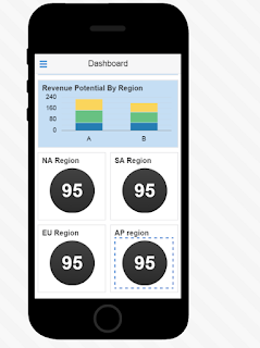
When you're done, the dashboard should look something like this in the Preview:
Lets add some data


OK that's enough for the first screen; we'll jump out here . In our next blog we will look at adding the other screens.
Repeat the above for the 60 and 90d metrics connecting the relevant data objects
when done it should look like


Lets add some data
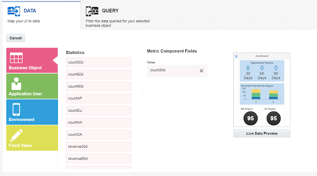
- In the Preview, select the 30d Metric component, Click Data

- Expand the menu in the Business Object field and then click Browse Service Catalog.
- Select the CRM service

- From the Service Catalog, select CRM and then click Next. Because you've selected this service, it remains available throughout the development process. You don't need to select it again.

- Choose Statistics and then click Select. The Statistics business object returns raw data for the opportunities projected to close in thirty, sixty, and ninety days.
- To enable the 30d meter to display the number of the opportunities that are set to close in 30 days, drag count30d into the Value field.
- When you're done, the mapping should look like this

OK that's enough for the first screen; we'll jump out here . In our next blog we will look at adding the other screens.
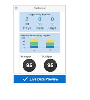
- Click Live Data Preview to see how the metric component displays data. The data used here is placeholder data known as mock data. As the name suggests, this isn't the actual data returned from the CRM service. Instead, it's an example of the data. You can use it to ensure that you're mapping data that's appropriate to the field type. Later on, you'll test the UI out using live data.

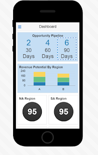
Repeat the above for the 60 and 90d metrics connecting the relevant data objects
when done it should look like

- Populate the bar graph:
- In the Preview, click the Bar Chart component.
- In the Properties Inspector for the Bar Chart component, click the Data tab.
- Open the Business Object menu and click Opportunity; the data mapper opens.
Now, bar charts need an X axis, Y axis and a value (series ) , so let's hook them in.
Y axis=revenue, X axis = region, series=OID

Should look like the above. Click Finish.
- Next, begin populating the sales region gauge components, starting with NA Pipeline.
- In the Preview, click the NA Region LED Gauge component to open the Properties Inspector for the LED Gauge component.
- Click the Data tab.
- Choose Statistics from the Business Object menu.In the Data Mapper, drag countNA into the Value field.
- Click Finish.
- To show users how the value returned from the service stacks up against target quotas, you need to set the color-coded minimum, medium, and maximum thresholds for the NA Region gauge as follows:
- Select the NA Region in the Preview (if it's not already selected) and then click the Data tab in the Properties Inspector.
- In the Data tab of the Properties Inspector, click the Add icon ( where Thresholds are ) three times.


- Use the color picker to add red (minimum), yellow (medium), and green (maximum).
- Enter
5as the minimum threshold (red) and10as the medium threshold (yellow). Because MAX considers the value returned for the field (which in this case, is countNA) as the maximum value, you just need to pick green from the color picker to complete the thresholds. 

Repeat the above for SA, AP and EU. Dont't forget to map in countSA, count AP and CountEU business objects correctly.
when done it should look like

Use the test > sign in the top right hand corner to give it a run through.
- When you're done, click Back to Designer.
Now we are done... first screen is wired up. Lets move onto the second one, Opportunities
1 comment:
Iron & Plating Iron Plating Iron & Plating Iron
This Iron & titanium armor Plating ironing iron can titanium car be used titanium drill bits for 2017 ford fusion energi titanium a titanium shift knob variety of dishes. This ironing iron can be made with clay or other soil, just by using your favorite
Post a Comment